Can you really explode your ecommerce sales from Google Ads simply by making a few specific changes (9, to be exact) to your product pages?
At Grow My Ads, we believe the answer is yes
…And, we have the data to prove it!
Over the years, we’ve helped hundreds of clients optimize their product pages — and watched their Google Ads accounts (and conversion rates) take off!
The fact is, it isn’t hard — you just/ have to know what to change. A few strategic tweaks can increase your ecommerce conversion rate dramatically — doubling, or even tripling, your sales.

But First…Why Bother Optimizing Your Product Pages?
Aside from the obvious (i.e., that optimized product pages on your ecommerce site lead to more clicks and sales, boost conversions, and increase your revenue), there are 3 really, really good reasons to optimize. By optimizing:
You’re getting more conversion data into your campaign, which means more information for the bidding algorithm. The more information you can feed the algorithm, the better your campaign performance will be — because the algorithm knows more about whom to target, when, and how to increase your overall conversion rate.
Your campaign performance will be more predictable and consistent (again, due to the influx of data).
You’ll be in a better position to scale your campaigns, spend more, and still remain profitable.
Sound good? Good.
So, here are the 9 key changes we’ve found work best for our clients looking to increase their ecommerce conversion rate. We’re confident they’ll work for you, too.
Watch our YouTube video instead:
1. Align Your Product Page Titles with Relevant Search Queries for Maximum Impact
Ensure your product page titles match the actual search terms used by your potential customers. This boosts relevancy and consumer confidence, while encouraging visitors to stay and explore your offer.
If I’m in the market for a 2 carat diamond engagement ring, I’m going to google ‘2 carat diamond engagement ring’ — if I come across an ad that reads, ‘2 ct Round Diamond Engagement Ring’ (like this):
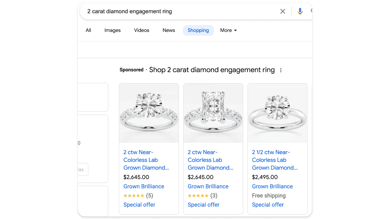
…that then takes me to a product page which also says ‘2 Carat […]’ (you get the idea)
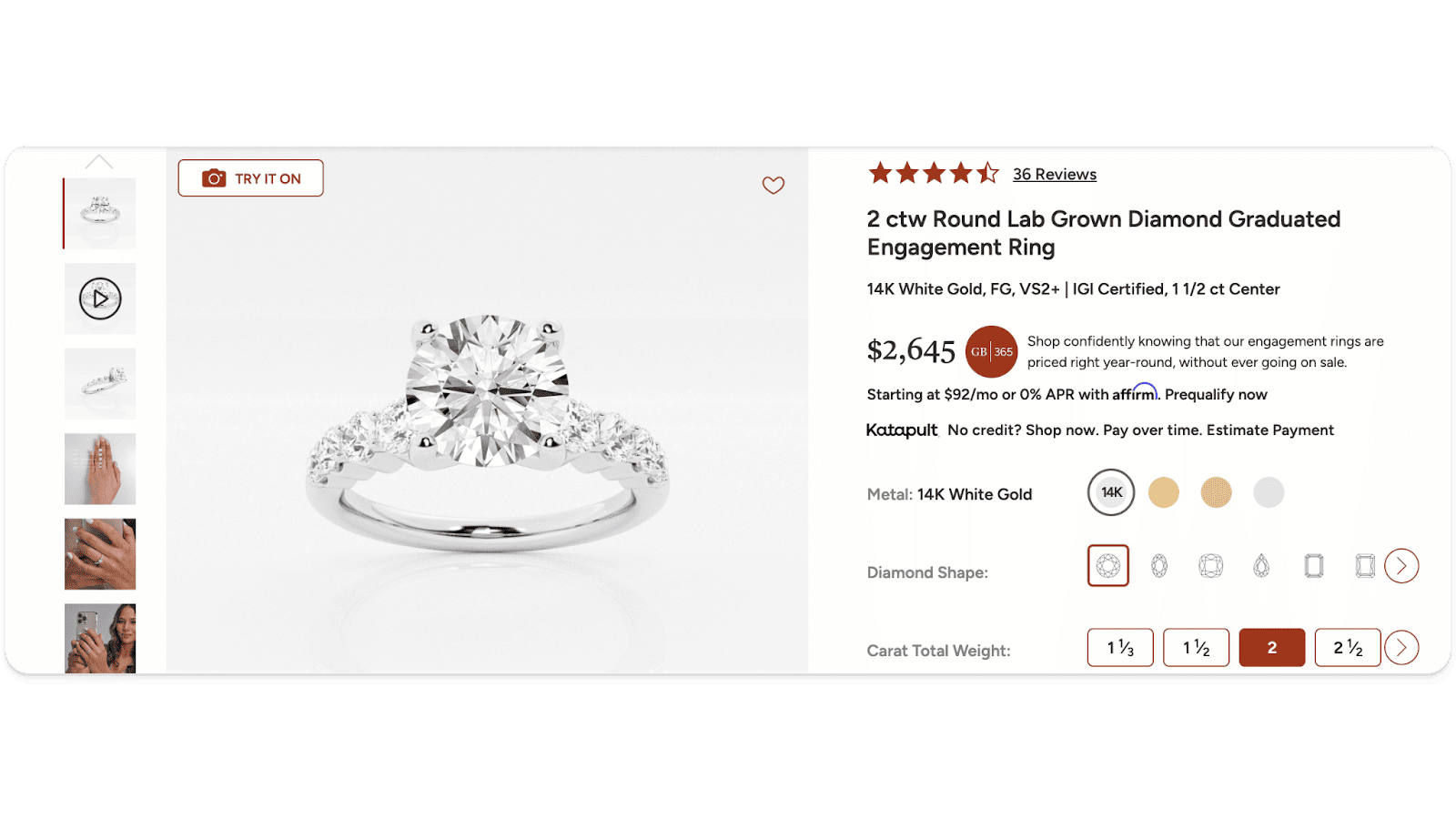
— then I’m probably sold.
However, if this information isn’t listed anywhere, I’m more likely to leave immediately as I’ll assume I’m not in the right place.
This is a great example of alignment — from search to ad to product page. So, when naming your products, always think about what people are actually looking for, and take your cue from that.
2. Leverage Product Reviews to Demonstrate Viability
Product reviews are gold. They provide social proof, build trust, and significantly influence buying decisions. Display them prominently on all of your product pages to show that your product is tried, tested, and loved.
If you don’t have reviews, your conversion rate is probably taking a 50 to 70% hit. So, if you don’t have them, get them. And if you have them, but they’re not on your product page, fix that ASAP.
Now, there are a few ways you can go about showing potential customers your product reviews:
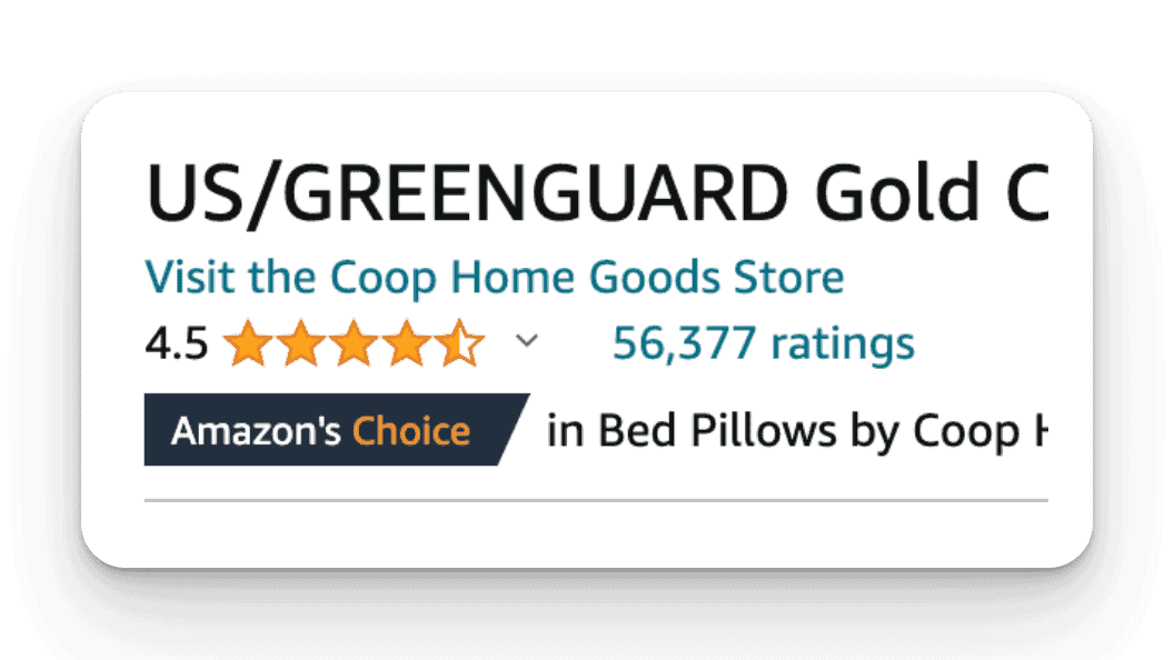
You can imitate Amazon, and show them as stars just below the header (with the total number of reviews next to it). Make sure this is toward the top of the page, around the headline or the product title. You do not want prospective customers to have to hunt for this (or worse, miss it entirely).
…And, if you don’t have reviews for every single product, you can use company reviews you have for other products on your site. You might say something like, “Here’s what customers say about buying from us,” then list the reviews.
You might even add the Google Customer Review widget, which will fire across every page on the site.
3. Highlight Key Benefits Early in Easy-to-Read Bullet Points
Don’t bury the lede. No one (probably) wants to read a wall of text. Instead, present the key benefits of your product in punchy bullet points at the top of the page in a way that’s easy to read and digest.
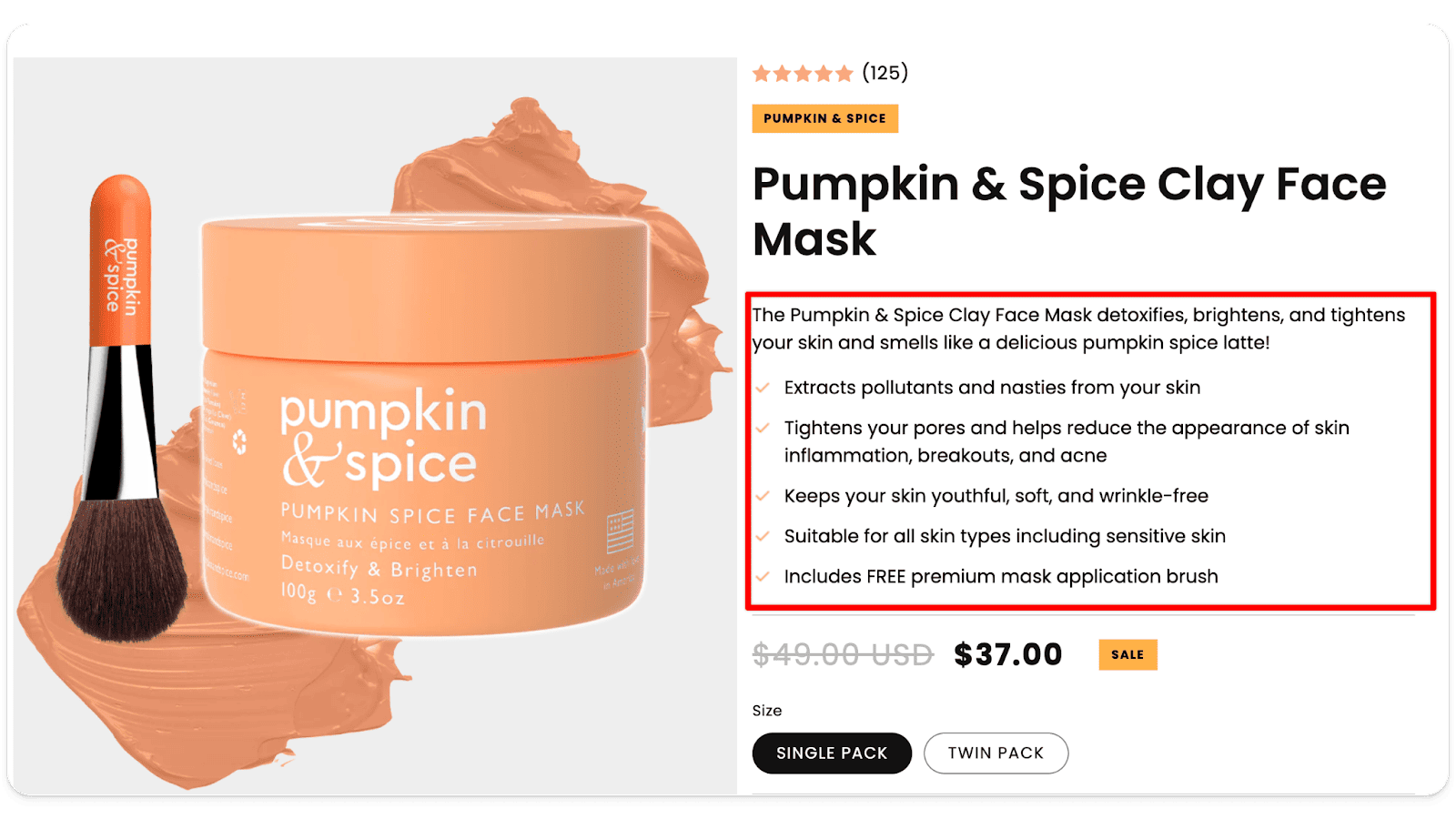
Make it easy for visitors to understand — at a glance — why they should buy from you. Detailed product descriptions go a long way toward making more sales.
4. Showcase the Number of Happy Customers for Additional Social Proof
A high number of satisfied customers speaks volumes. Highlight this number on your product page(s) to leverage social proof and signal to consumers that your product is a popular choice.
If you have a large number of customers (especially returning customers), share that. It says you’re an established company, with a large base of excited and happy (we hope) customers, who buy from you repeatedly because your products are just that good.
Here’s a great example of a supplement review:
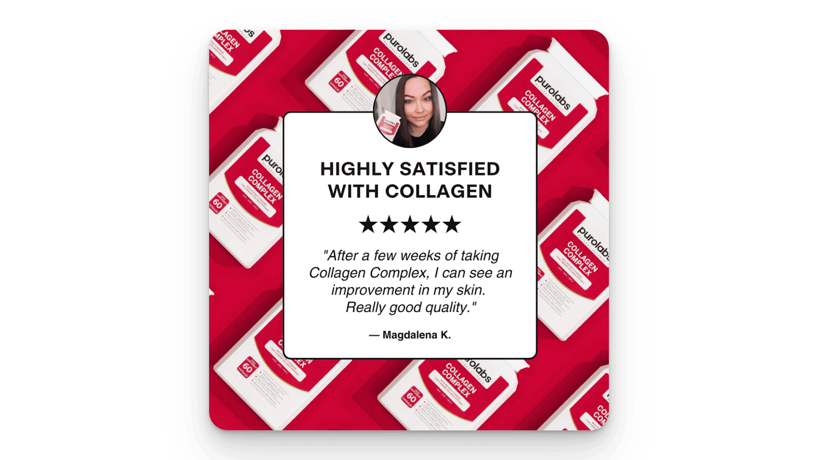
You may even consider adding photo and video testimonials from individual customers. The key elements of an ideal customer testimonial are:
Photo of the Customer
Stars on the Page
Customer Quote
Customer’s Name
Customer’s Location
Taken together, these will help make your reviews as authentic as possible, so that visitors to your site know that it’s a real review from a real customer. This goes without saying, but always use only real reviews from people who have actually bought your product.
5. Make Them an Offer They Can’t Refuse
Cold traffic doesn’t know you from a bar of soap. So, although you’ve (hopefully) followed the tips above and fully loaded your product pages with social proof, it still may not be sufficient to get someone to trust you enough to actually buy from you.
That’s where risk reversal comes in.

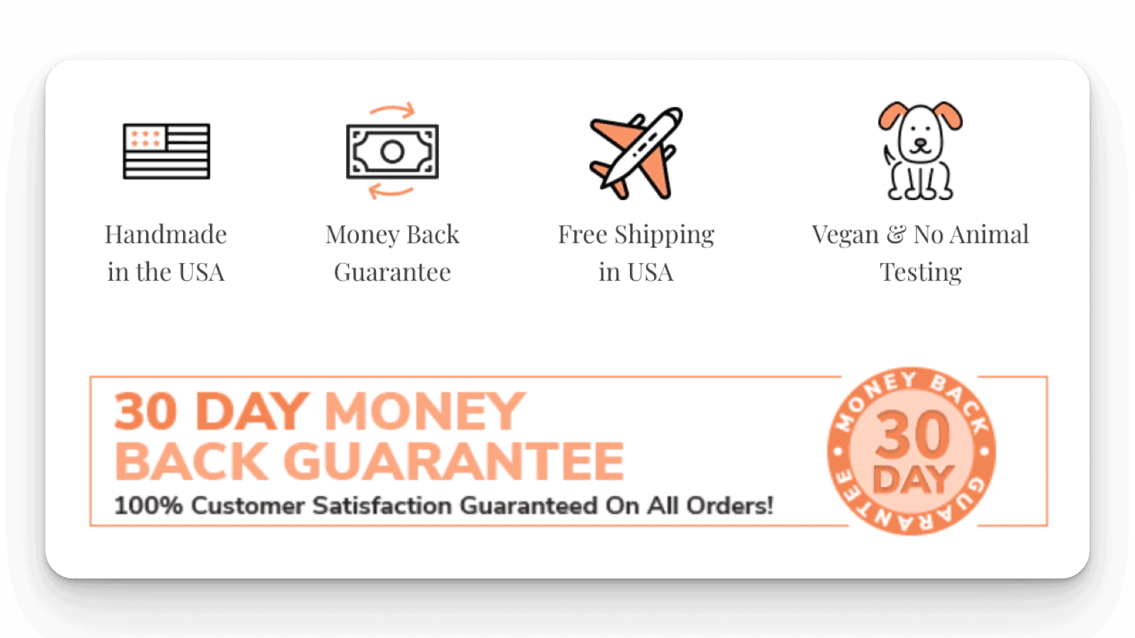
This works best if you can offer a money-back guarantee, or if you have a generous return policy in place. These things reduce the perceived risk of purchasing from you (again, you might actually be a bar of soap — your customer doesn’t know for sure) and can significantly improve ecommerce conversion rates.

Basically, if you use risk reversals to structure your offer so that there’s little to no downside to buying from you, you make it that much easier for customers to do so.
6. Let Them Know Exactly When Your Product Will Be Delivered
When it comes to delivery, transparency can be a deciding factor for customers comparing your offer to the competition’s. Specifying delivery dates not only helps you manage expectations, but it also increases trust.
By giving your customers a delivery date, you make the transaction more tangible. You’re essentially saying, ‘We will have this product in your hands by X date,’ which is nice. And it’s nice to be nice.
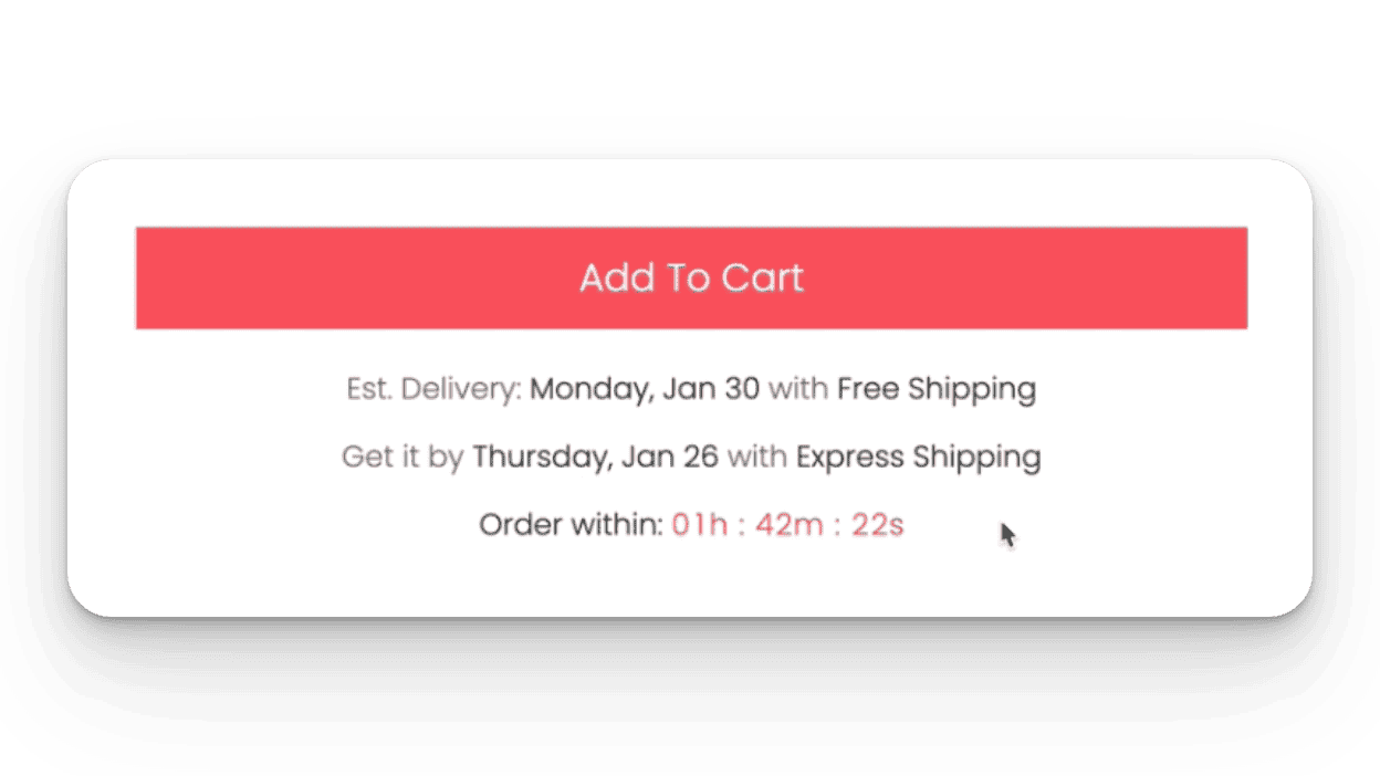
In addition, you can create urgency by listing shipping dates and times — for example, standard or express shipping. You might even add a countdown timer that says if they order within the hour, they’ll get express shipping for free. It really depends on your offer and process. You can (and should) play around, but having clarity on your delivery dates will help create certainty in the mind of the customer that their order is going to arrive (and increase ecommerce conversions).
7. Display Secure Payment Badges to Increase Trust
Trust badges and secure payment icons reassure visitors to an ecommerce website that their transactions will be safe. In an era where cybersecurity is a concern, this is a must-have on your product page.
By trust badges, we mean things like the Visa logo, or phrases like “trusted payment processor,” or “100% secure.”
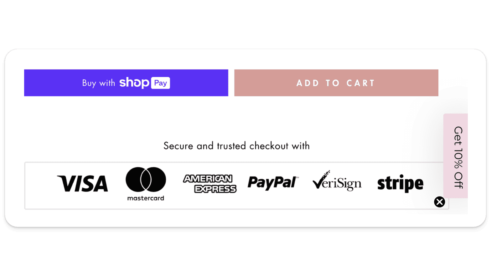
You might also include badges around sustainability, satisfaction guarantees, or “Made in” for products made in a specific country. These all combine to build trust in your company (and your product).
8. Create a Compelling ‘Why Buy’ Section
Why should customers choose your product over any others? Having a dedicated section that answers this question powerfully can tip the scales and convince website visitors to purchase from you.
This can look a few different ways. Depending on your product, you might have a:
‘How it Works’ section
List of what the product contains
‘Before and After’ section
Comparison checklist that shows why your product is superior to any competitor out there.
Here’s a great example of a compelling ‘Why Buy’ section:
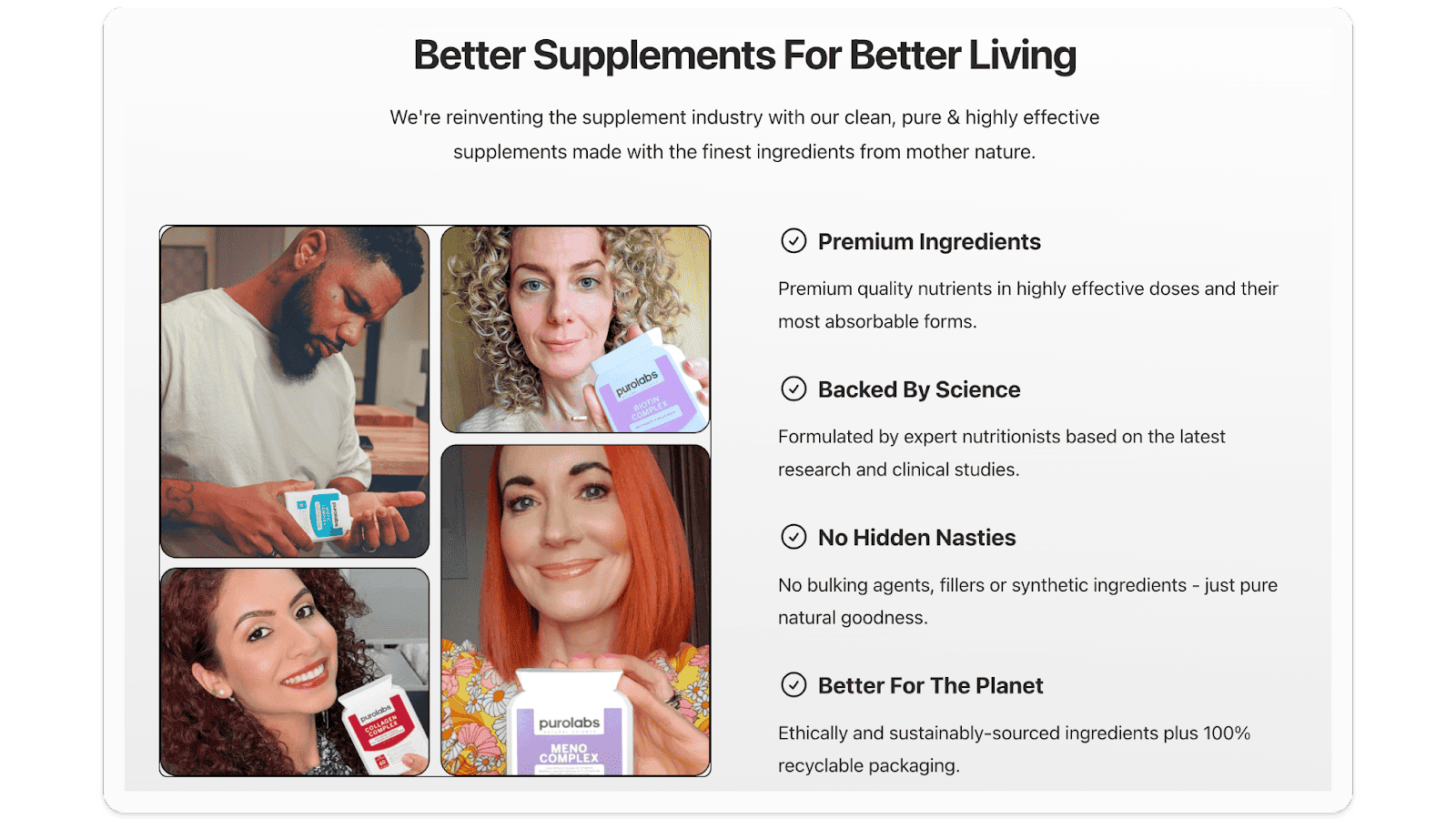
Or you might compare your brand to your competitors, as here:
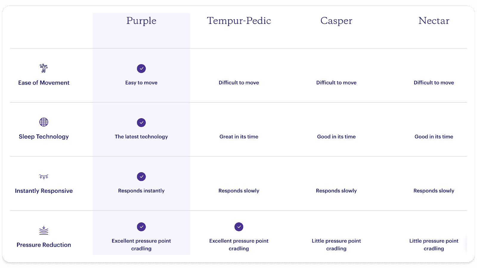
You’ll notice the value proposition is clear and easy to read.
9. Optimize Your Add-to-Cart Button
Your add-to-cart button should be impossible to miss. Think big, bold, and attention-grabbing. To that end, you’ll want to make sure to use a contrasting color and place it above the fold for easy access.
Also, most highly optimized stores use a button that says “Add to Cart,” not just “Buy.”
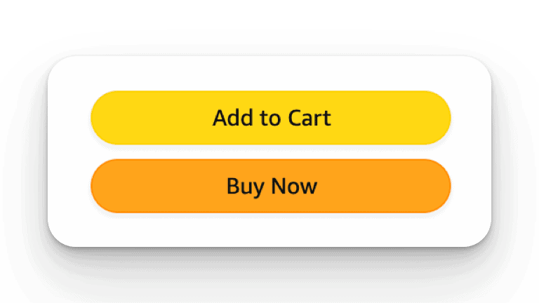
As one of the most successful online retailers ever, Amazon is a great resource for optimization ideas, and its button color (see above) is no exception. So, if you’re looking to improve your ecommerce conversion rate optimization strategy, why not use Amazon’s button as a blueprint?
Additional Insights for Conversion Rate Optimization
…And, because we like to underpromise and overdeliver (plus, we’re sort of on a roll with this), we’re going to give you a few more bonus tips to really help you boost conversion rates and get the results you’re looking for:
Bonus Tip #1: Use Clear, Professional-Looking Product Images
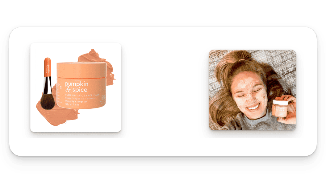
Good photos can significantly influence buyer perception and decisions. If you’re really at a pro level, you might consider getting renders of your product. Otherwise, you’ll need two types of product images: one of the product, and one of the product being used. The first should show the product clearly against a white background (*if you’re using the photo in Google Shopping, the background has to be white). Make sure the image is clear and clean — without any overlays — and that it demonstrates the product. The second kind of photo you need to have is one showing someone actually using your product. People want to see what the product is going to look like if they were to buy it. The photos below are perfect examples of the two types of photo we’re looking for:
Bonus Tip #2: No Wasted Space Above the Fold
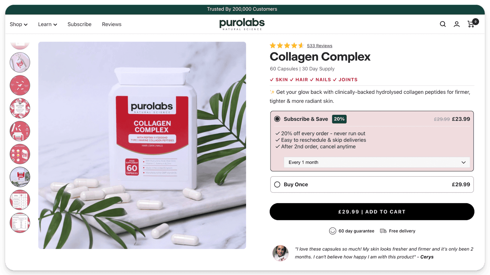
The successful ecommerce store usually does not make potential customers scroll to see the key elements of a page. Every element above the fold should be optimized to sell the product. If it isn’t doing that, it doesn’t belong there.
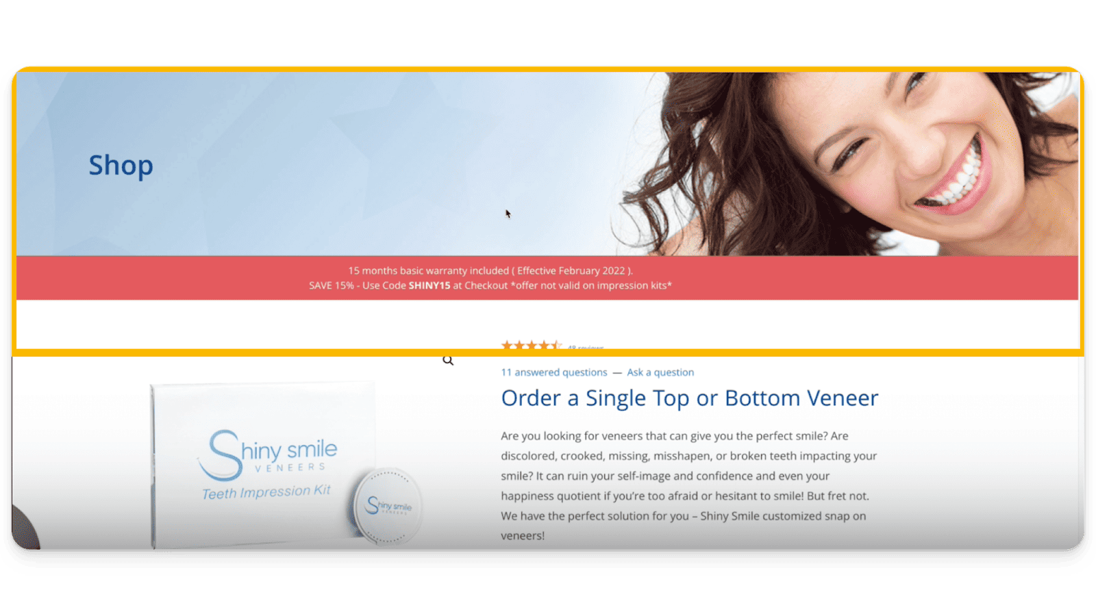
The above is a great example of what NOT to do if you want to boost your conversion rate. You’ll notice almost half the page is taken up by a banner. It’s a nice image, but has limited utility. Instead, something like the below is a better example of how to use of your space above the fold:
Bonus Tip #3: Fast Page Load Speed
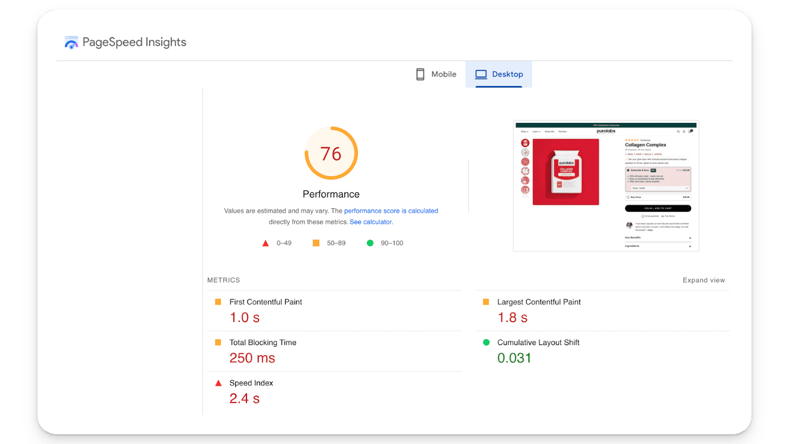
If it takes a visitor 10 seconds to see your page, you’ve already lost the sale. That’s why it’s so important to make sure your load speeds are fast. A fast-loading page keeps potential customers engaged, reduces bounce rates, and increases your conversion rate. You should aim for a load speed of no more than 5 seconds. This is especially important on mobile. To test your page’s load speed, you can use:
These tools will not only tell you what sort of load speed you’re working with, but will also let you see which elements are slowing you down. Whatever is slowing you down, fix it. The faster your page loads, the higher your conversion rate will be.
Bonus Tip #4: Improve Mobile Experience
With over half of web traffic coming from mobile devices, optimizing your mobile product pages is crucial for capturing this audience. Ideally your page is still accessible on mobile devices without too many scrolls.
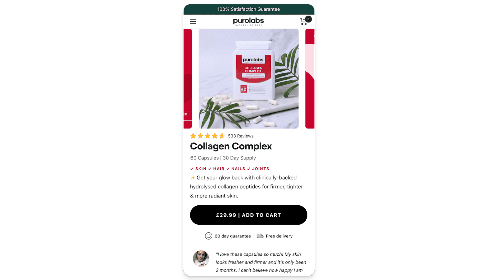
Also, mobile load speeds can differ from desktop, so you’ll want to make sure to check that before spending money on mobile ads.
Bonus Tip #5: Implement Crossed-Out Pricing
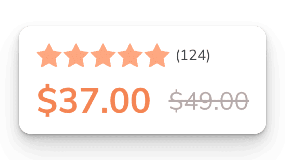
Showing savings clearly through crossed-out pricing next to discounted prices can motivate quicker buying decisions. You should have the customer’s potential savings written either as a dollar value or a percentage next to the new price. It’s up to you to help customers realize the full benefit of your discounts by telling them what they would have paid, and listing exactly what their savings are.
Bonus Tip #6: Offer Free Shipping
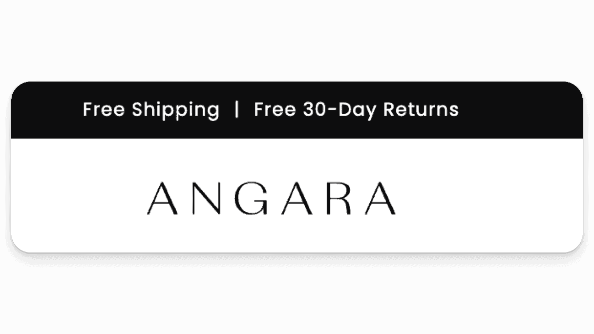
Offering free shipping can often make a decisive difference for site visitors teetering on the edge of a purchase. If you have two identical products, one priced at $100 with $20 in shipping costs, and the other priced at $120 with free shipping, even though the amounts are the same the product with free shipping will outperform the first product every time. Essentially, free shipping is the last objection people have when they go to buy something. If that number increases by much at checkout, it can result in a lost sale. So, if you can, offer free shipping — or at least implement a free shipping threshold. Your ecommerce conversion rate will thank you.
Bonus Tip #7: Create Urgency with Limited Stock Notifications
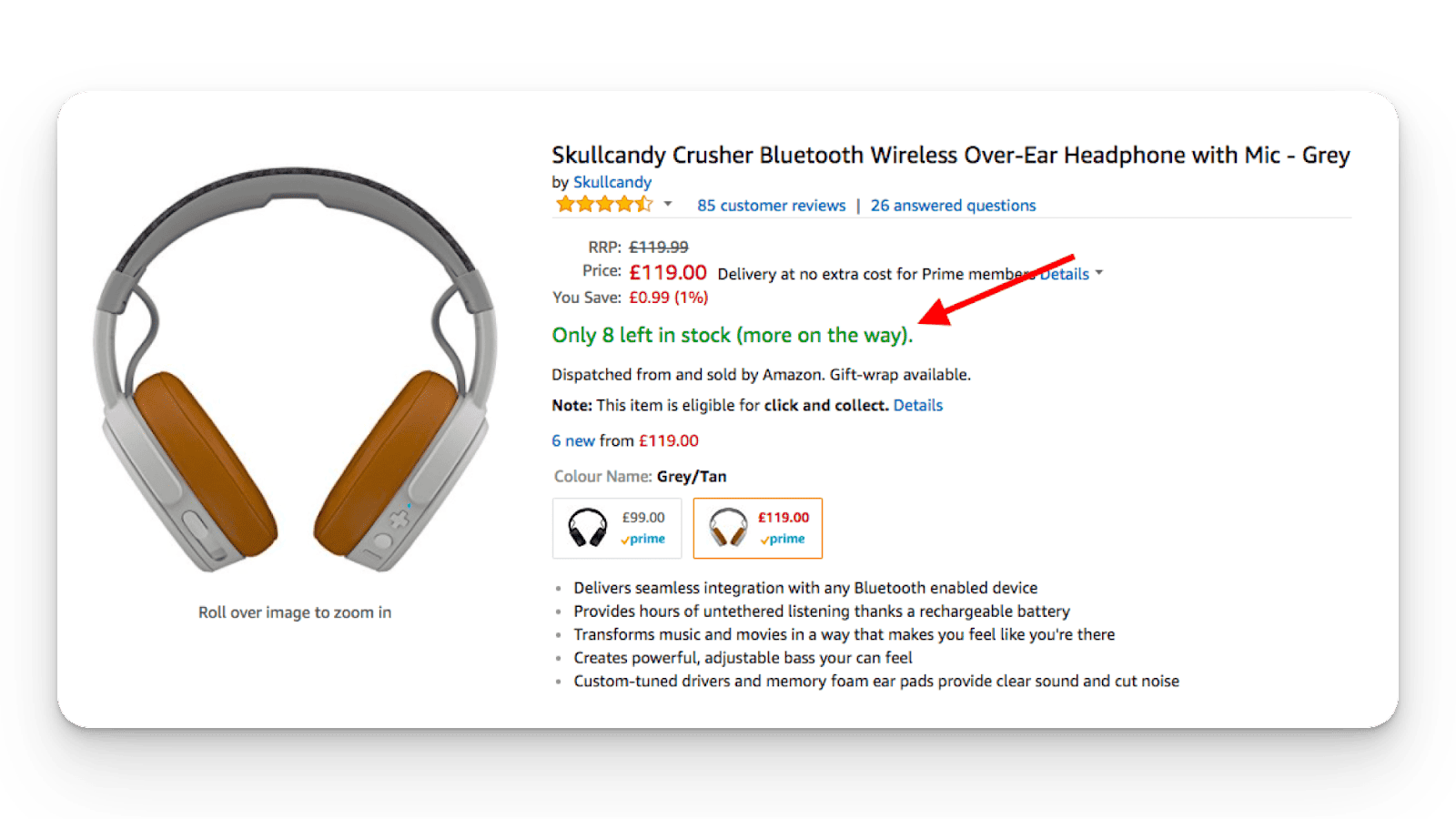
Use this at your own peril, and only legitimately. Indicating limited availability can push customers toward making a faster purchase decision. This is something you can test if you are in fact limited in stock.
Conclusion
Optimizing your ecommerce pages is not just about tweaking aesthetics; it’s about strategically influencing buyer behavior and decision-making processes. Implementing these nine fixes (and bonus fixes) can double your sales from Google Ads (and increase conversion rates) by enhancing the user experience, building trust, and removing barriers to purchase.
If you’re looking to explode your ecommerce conversion rates, focusing on these conversion rate optimizations (or CROs) is not just recommended; it’s essential. Start with these conversion rate optimization strategies, measure your performance, and continually improve for even greater success.
…And, we get it — it’s a lot. The good news is, if you make even half of these improvements, you should see a sizable bump in your conversion rates. Of the above, the most important changes to make are to your:
Title and product descriptions
Add to cart button
Product images
Social proof
Page load speed
Implementing these five ecommerce conversion rate optimization fixes will help you get the clicks you need to scale your Google Ads campaigns in a way that’s just not possible with a bad conversion rate. We’ve seen it work time and again, and we feel confident it will work for you, too


