You can have the perfect ad— amazing keyword selections, solid copy, great strategy— and still have it completely flop if it isn’t followed by a strong landing page.
Unfortunately, we’ve seen this happen more times than we can count.
There are great ads that promote the benefits of a product, hit all the right unique selling proposition (USP) notes, and have great copy… all to go on to get clicks but no conversions.
Getting great results from your Google Ads isn’t just the responsibility of the ads themselves, so in this post we’re going to talk about how to create landing pages for Google Ads that will actually drive conversions.
Why Landing Pages Are Imperative
When users see your ad, are interested, and then click, that’s momentum. They’re paying attention to what you have to say and what you have to offer.

Then they get to your landing page. They can either keep that momentum going, or succeed by driving conversions (or users) away.
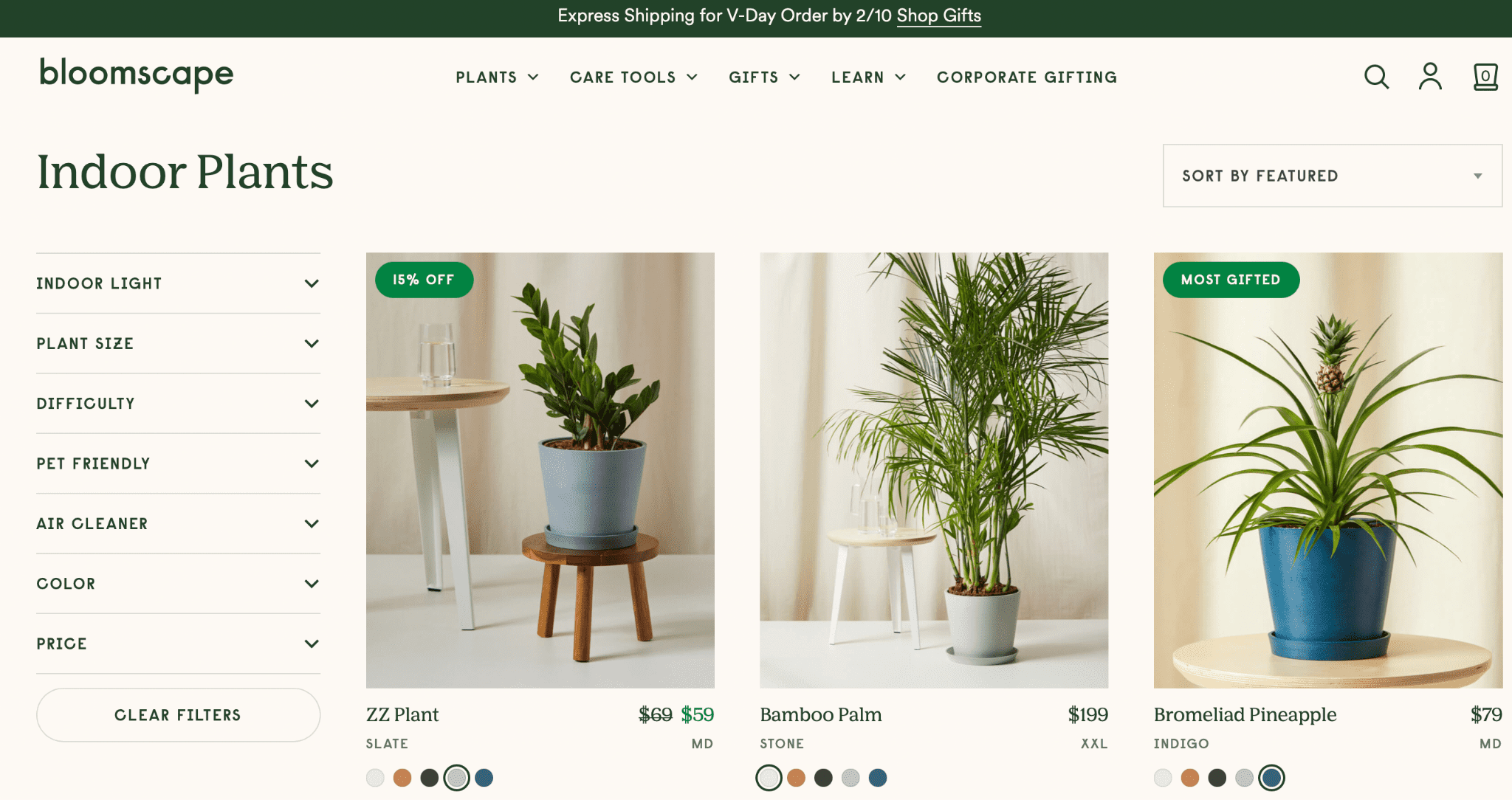
Imagine clicking on an ad and finding any of the following:
- The landing pages takes too long to load or doesn’t load properly
- The page has “Yelp reviews” listed, but doesn’t actually link to Yelp (which many consumers know now not to trust)
- There lead form doesn’t work when you try to submit it
- It doesn’t feature any information that you were hoping to find (or, you clicked for “free instant quote” but then it just wants you to set up a call)
- The landing page doesn’t mention the product or service you were searching for to begin with
If you’re like 99% of people, you’re going to click away, and you’ll have a negative association with the brand in question. You’ll be unlikely to give them another chance.
What Your Landing Page Must Accomplish
To be successful, your Google Ads landing page must accomplish the following:
- Match the ad copy. You don’t want to have an ad for indoor plants and then show users a product page for outdoor plants. Not only will this irritate users and/or convince them that you don’t have what they’re actually looking for, but Google doesn’t love it either. A mismatch in ad copy and landing page content can quickly decrease your Quality Score.
- Follow Google’s security and privacy guidelines. You can see the full list here, but make sure that you have a terms of service and privacy statement visible.
- Be responsive, mobile-friendly, and fast-loading. This includes on desktop and mobile, of course; you want to have your page load correctly, and fast.
- Have a strong, clean format. We’ll talk more about what this looks like in a minute, but the last thing you want is to have users come to a cluttered or confusing landing page.
- Explain what your offer or value proposition is. The ad itself is like a little teaser, and your landing page is the actual sell. This is where you elaborate more on the specific features and benefits you can offer leads, and convince them to take the desired action.
- Have visible links to other parts of your site, like an “about me” or the home page. It’s typical for people to need more information, and if your landing page appears to exist in a silo (and doesn’t seem connected to the rest of the site), many users won’t trust it.
- Provide a direct way for users to take action, and include a call-to-action (CTA) for them to do so. Whether you want them to make a purchase, call your business, complete a lead form, or register for an event, make it incredibly simple for them to take that action. Reiterate why they should, and have a clickable CTA button to make it easy for them to take that next step.
How to Create Strong Google Ads Landing Pages That Convert
In addition to the above recommendations that we just discussed, having specific tips on hand can help you when you’re determining how to create Google Ads landing pages that drive results.
These are the seven most important best practices (and examples that came from real Google Ads!) you want to make sure you’re following for success.
1. Start with a Simple Format
Some landing pages look chaotic or are difficult to navigate, and this is the last thing that you want.
You also don’t want to drown users in a block of text.
Opt for a simple landing page. If you’re going for a lead generation sign-up, the below is a fantastic example:
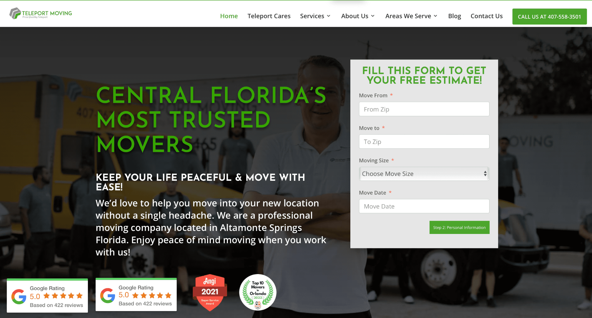
You’ve got:
- A headline
- A subheadline
- Some copy that elaborates more on their services
- A lead form to get a free estimate
- Social proof in the form of links to five-star reviews and awards, which can be clicked for verification purposes
2. Keep Your CTA Above the Fold
You need a clear CTA and CTA button that tells users what to do. Request a quote, sign up for a free class, get your discount, register, etcetera etcetera.
It’s crucial that your CTA is visible the second that the page loads; you don’t want to send users looking for it, because there’s a good chance they wont.
Have basic supporting text explaining why users should take an action, and then have that CTA button (ideally in contrasting colors) placed immediately underneath.
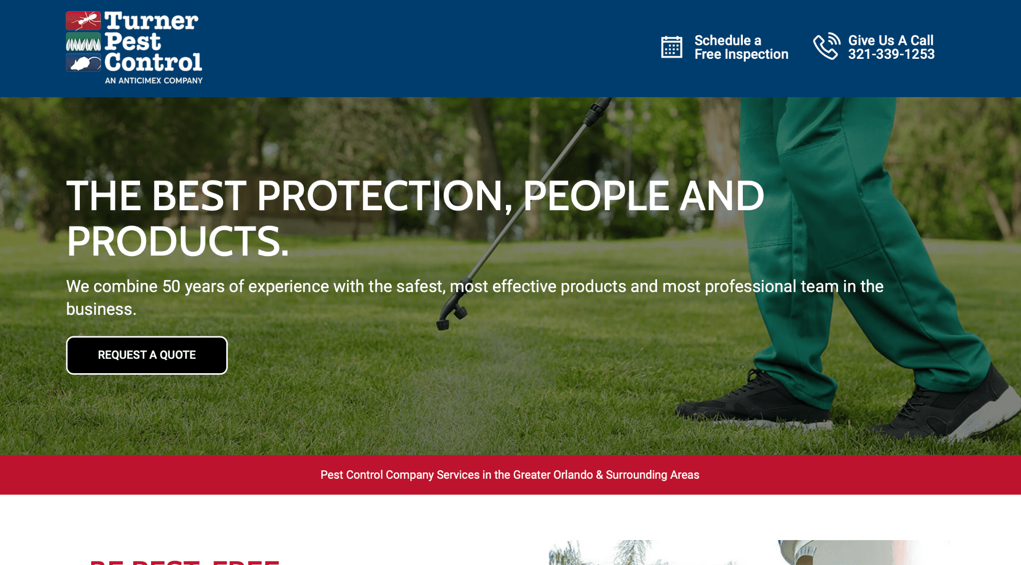
You’ll notice that in the example above, the page is cut off at the bottom. That’s where the fold is, and where I’d need to scroll down to read more. If I wanted a quote quickly, I could do so, but if I wanted more information I could keep scrolling and reading to find out more, which is what makes this the perfect format for many landing pages.
3. Focus on a Single Conversion Action
We’ve talked a bit about how you might use a landing page for a ton of different types of conversion actions. And in many cases, you might be just as happy to have a customer sign up for your email newsletter as you are to have them follow you on Facebook or to make a purchase.
That being said, you need to pick a single action to optimize for on a landing page or users will legitimately get overwhelmed and not pick one.
You can have links on your page that makes it easy for users to take other actions, if they absolutely want to, but guiding them to the next stage of the sales funnel by focusing on that single conversion action is key.
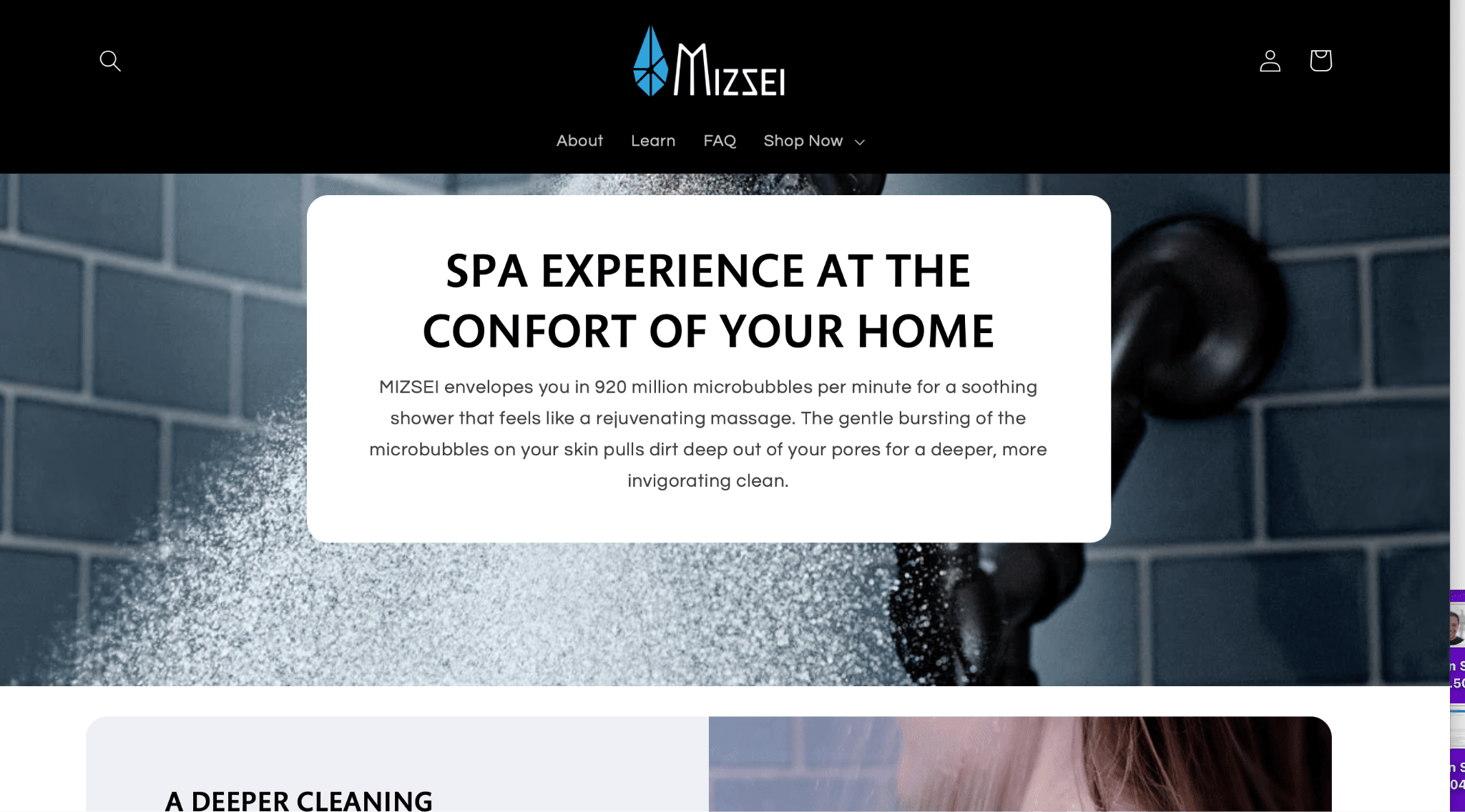
4. Use A Single Visual Focal Point
One of the biggest mistakes you’ll see with landing page that are trying to promote a single product or service (including digital products like ebooks) is that there are too many visuals.
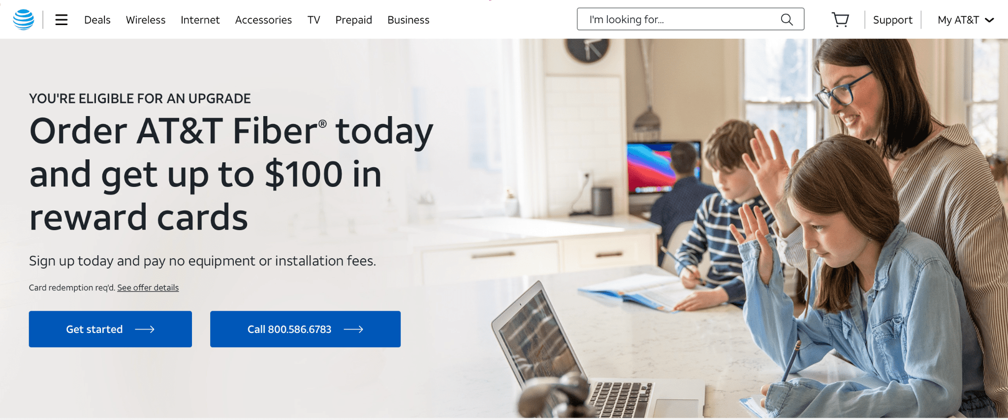
It’s best to stick with a single visual focal point above the fold. This might include a background image of the product or service and a block of text; it also could include text next to a brief video (which has pause buttons and allows users to skip around!) or an image, or a carousel of images that users can scroll through.
But it probably shouldn’t have 5 different pictures all at once competing for attention, at least not above the fold.
Here’s an example. There’s a clear visual focus that directs users to product education. Underneath is a list of benefits with images of the product, but right at a first glance they kept it simple. It directs users to where their attention is needed to increase the odds of a fast conversion.
5. Write Great Copy
Great copy makes the world go ‘round. Or, at the very least, it makes users convert.
Your copy needs to be great and answer all of a user’s questions for them to take that first conversion action, so keep the following in mind:
- Understand your target audience’s needs, pain points, and motivations and how your product can address them; make sure you mention it clearly
- Be descriptive enough to inform while still keeping it short and sweet
- Consider leveraging scarcity or urgency, especially if you’re promoting a limited-time product, deal, or sale
- Make sure that you’re highlighting why users can benefit not only from your product or service but the specific action you want them to take
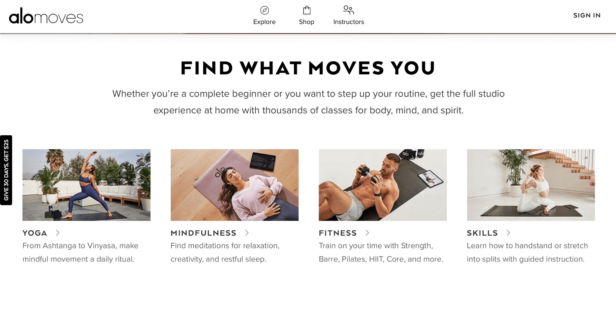
This ad copy, which appears below the fold on a landing page, tells the viewer that no matter where they are in their fitness journey, the service is for them. It’s a good way of making sure people themselves as your audience.
And if you need help with copy for your ads? We’ve got a guide on Google Ads copywriting.
6. Split Test
You need to be spit testing (or A/B testing) your landing pages just like you split test your ad campaigns. (And if you don’t do that, you should!)
There are different tools that allow you to test different versions of the same landing page to see what users respond to.
Unbounce is a good one. They also have AI-driven optimization features, if you prefer that, that will show personalized versions of a landing page to users based on what they’re most likely to respond to.
And for our clients who are Shopify users, there are a few tools that can help with this; Pagemunch Landing Page Builder is a good one.
Test different aspects of your landing page one step at a time, including the headline, the copy, any microcopy you’ve created, your CTA, your lead forms, and the images.
7. Check For Technical or Accessibility Obstacles
The last thing you need to do once your landing page is created is to test it thoroughly for both technical and accessibility obstacles.
Is the entire page loading quickly and correctly on desktop and mobile with multiple browser and device types? Are users able to submit the lead form or use all of the key links you have featured? Can they click on CTA buttons?
You also want to think about digital accessibility for your landing pages (and your website overall). Many users, for example, rely on screen readers, keyboard navigation, and voice search if they have disabilities like blindness or poor motor control; you also need closed captions or transcripts for deaf and hard of hearing users.
Not only can this make your page more accessible to all potential customers, it’s also important for legal liability reasons. Following the most recent version of the WCAG guidelines is a good place to start.
Final Thoughts
Creating great ads isn’t easy, but the last thing you want to do is to create killer ads that are absolutely crushing it with click-through rates (CTRs)… but that absolutely tank at the landing page.
While there could be other issues like a mismatch in the audience you’re reaching and you’re target audience (like someone who wants a $20 pair of shoes seeing a landing page for a $2,000 pair of shoes— no copywriting can overcome that), a weak landing page is a common culprit here.
So be diligent about your landing page creation process. Test different page variants throughout the entire sales funnel and for different audience segments to see what works, and watch your conversion rate start to climb.
Need help improving your Google Ad performance? We can help. Learn more about how we work here.


